Posts

Non-Western Art (South Koren Art pre war vs post war)

Image
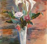
 I chose to do my exhibit as a comparison of pre and post-war Korean Art.  I find it interesting how easily Western countries can influence things in other countries while Western influence has no effect on other things. Pre-war Korean art was heavily influenced by Japanese art.  As you can see in Calla by Lee In-sung in 1932  pictured above.  In this oil painting, you can see the vibrant use of color that has a sort of hazy-like feature with some of the blurred and shaded lines. Pictured below we have some of the Goguryeo Murals.  At first glance at some of these murals, you may see Japanese emperors and Samurai but these are located in a tomb in Northern Korea during a prosperous Korean time period Post-War Korean Art (Minjung Art or the People's Art Movement of the 1970s & 80s) This art movement was brought on by an impending uprising of the people looking to bring democracy to South Korea.  Later on in the 80s came to be a founded art group called Reality and Utterance.   A

Postmodern Art

Image
The above painting is Wham by Roy Lichtenstein painted in 1963 and first put on exhibit in New York.  This work looks like it is derived from a comic with the plane on one side firing a missile that strikes another plane on the other side.  Lichtenstein used a DC Comic for inspiration on this piece.  He uses reds and yellows to highlight the explosion with the words in yellow looking like it came from the center of the explosion.  Looking at Lichtenstein's painting below titled Blam painted in 1962 you can see that his art tends to resemble comic strips.  There is some controversy with some of his work and plagiarism since most of his art heavily resembles already printed comics. Next, we have the above on top from the famous Andy Warhol Gold Marilyn Monroe (1962).  This is likely one of the most iconic paintings of this era.  Warhol was heavily into pop culture as you can see from the painting titled Coca-Cola (1962) directly under that one.  Warhol used black and white to create

Romantic Era: Realist Art Compared to Impressionist Art

Image
 Impressionist Art     Impressionism is probably my favorite type of art.  A lot of paintings done in this style have a lot of "blurred" detail almost making the art look unfinished.  To me, it would take a lot of skill, patience, and will to intentionally paint something whose end product has so many blurred lines and details.   Claude Monet,  Impression Sunrise , 1872.     Just look at how Monet added the reflections in the water but yet left blurred lines some of which create the ripples in the water.  This is a beautiful representation of a sunrise on the water.  This is the painting that paved the way forward for  impressionism. With the free-flowing lines and lack of a set of rules, this quickly became a popular type of art.  Monet also used this scene of a picturesque sunrise to also portray the dawn of a new industrial era.   Elmer MacRae, Back of Old House , 1910.     In impressionist art, it is normal to see the strokes from the artist and it is no longer cliche.  

Revolution and Art in the 1700's

Image
  The Classical art era was sort of America's founding art era.  Much of America's identity is and was centered around classical art.  The revolution came during a period when many classically trained artists were making their way across the pond to depict life in the colonies.  Through the paintings below you can see how American artists depicted the war compared to how a British artist depicted the war.  When looking at the examples below think about how far away and disconnected the king was at the time of the war. John Trumbull The Death of General Mercer at the Battle of Princeton Jan 3 1777 ca 1789 This has been said to be one of Trumbull's favorite paintings.  The painting depicts a major turning point in the war.  The painting tries to depict that even though an influential leader has been taken out someone can still step up and win the battle.  Which is what George Washington actually did.  The artist uses light and shadow to draw the viewer's focus to the pain

Renaissance (Baroque Era)

Image
Venus and Adonis by Peter Paul Rubens 1635 Elements Rubens used a mixture of dark and light to emphasize the scene he wanted to depict.  The main scene here is Venus trying to get Adonis to stay and not go out hunting while Cupid is holding onto his leg.  The partial nudity of Venus was put in there so as to depict the drama happening in the scene.  There is a factor of longing of the heart brought on by this painting with Venus wanting to hold onto Adonis and not letting him leave.  This is Ruben's take on this mythological scene that was also painted by another artist ( Tiitian ) depiction of the scene almost 100 years prior.  The Thirty-year War The above version was one of multiple renditions of the same seen from Rubens.  When he was commissioned to paint the first one Rubes it was just after the Thirty Year War and was happy to be able to do something that didn't have diplomatic ties.   Words Cited “Venus and Adonis (Rubens, 1635).”   Wikipedia , Wikimedia Foundation, 10

Italian Renaissance Dive

Image
                                                                    Piece Introduction This piece is titled  'Madonna della Vittoria'   by Andrea Mantegna.  When looking at this piece the humanism in it really stands out.  This painting was created to celebrate an unlikely victory over the French in 1495. That is why it has so many military attributes. The central focus here is essentially paying homage to Saint Elizabeth and Saint John (pictured in the chair in the center).  Humanism is first and foremost in this painting. The artist here is trying to equate the military's faith in the saints to their recent victory. This all but gives the credit of victory to the saints while ensuring that the military is shown as being servant and grateful.  My Humble Opinion I do not care for much of the art in this era and this painting isn't any exception.  Don't get me wrong the painting was done well for its era.  I just have never understood why people have to take all the

Geometric Wildlife Sculpture Art Analysis

Image
Thought Process  I decided to look into geometric sculptures with a wildlife emphasis.  I really enjoy nature and the way things just flow with no rhyme or reason to it.  To me, nature doesn't follow conventional rules of art with things having to be a certain shape or way.  I also enjoy the aesthetics of how geometric shapes look because they follow strict rules with straight lines and sharp corners.  My brain enjoys trying to blend those things together. Chosen Art Piece The sculpture pictured below really caught my eye.  The sculpture was created by Ben Foster and is titled Golden Boy. My Perception When you first look at the placement of this sculpture it may seem out of place, but when you look deeper into the photo you see the snow-capped mountains in the background.  The artist blended the unnatural geometric lines of his sculpture with the surroundings of a New Zealand mountain range.  Seeing something as natural as a dog created with geometric lines and shapes is interesti